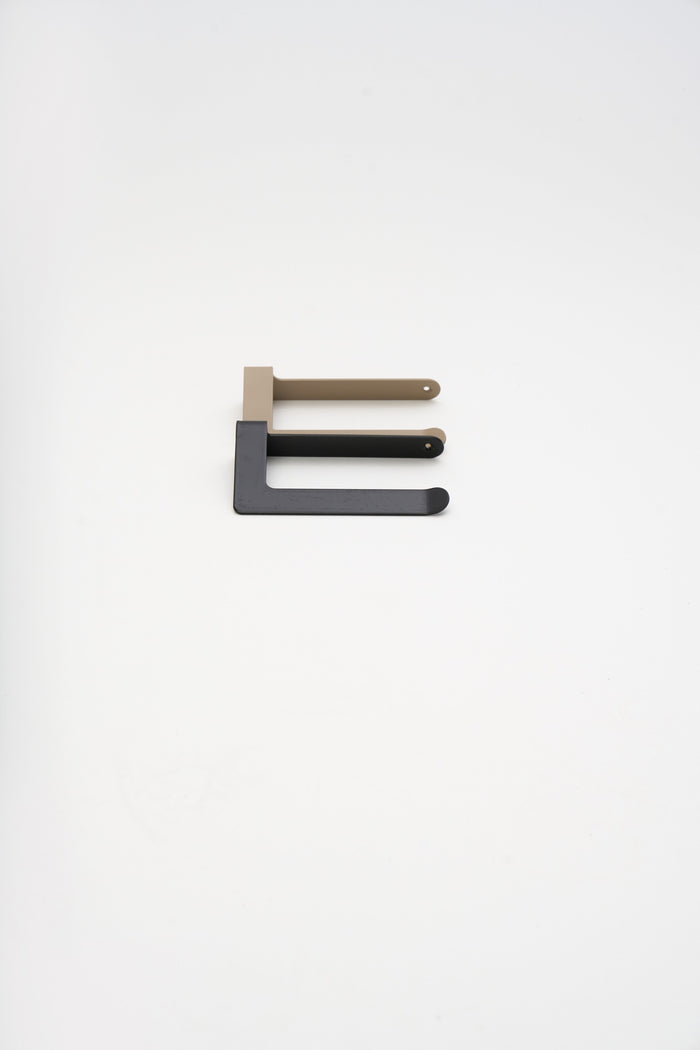
TL;DR: ATYP powder coats every piece in one of five house finishes: Chalk (RAL 9016, matte white), Linen (RAL 1019, matte grey beige), Slate (RAL 7016, anthracite with a structure grain), Umber (RAL 8022, black brown structure), and Graphite (RAL 9005, jet black structure). Any other RAL shade is available on request, confirmed against a physical sample before coating.
Colour names on furniture sites usually mean nothing. Ours map to exact RAL codes, the industrial colour standard that powder suppliers, architects, and coaters all read the same way. Name the code and you know precisely what arrives. Here is each of the five, what it looks like on steel, and where it tends to work.
Chalk, RAL 9016

A soft, even white that holds daylight. Chalk is a matte surface, smooth to the touch, and it reads warmer than a printer-paper white because the powder skin diffuses light instead of bouncing it. On a white wall it almost disappears, which is the point: a METI shelf in Chalk carries its towels and bottles without adding visual weight to a small bathroom.
Linen, RAL 1019

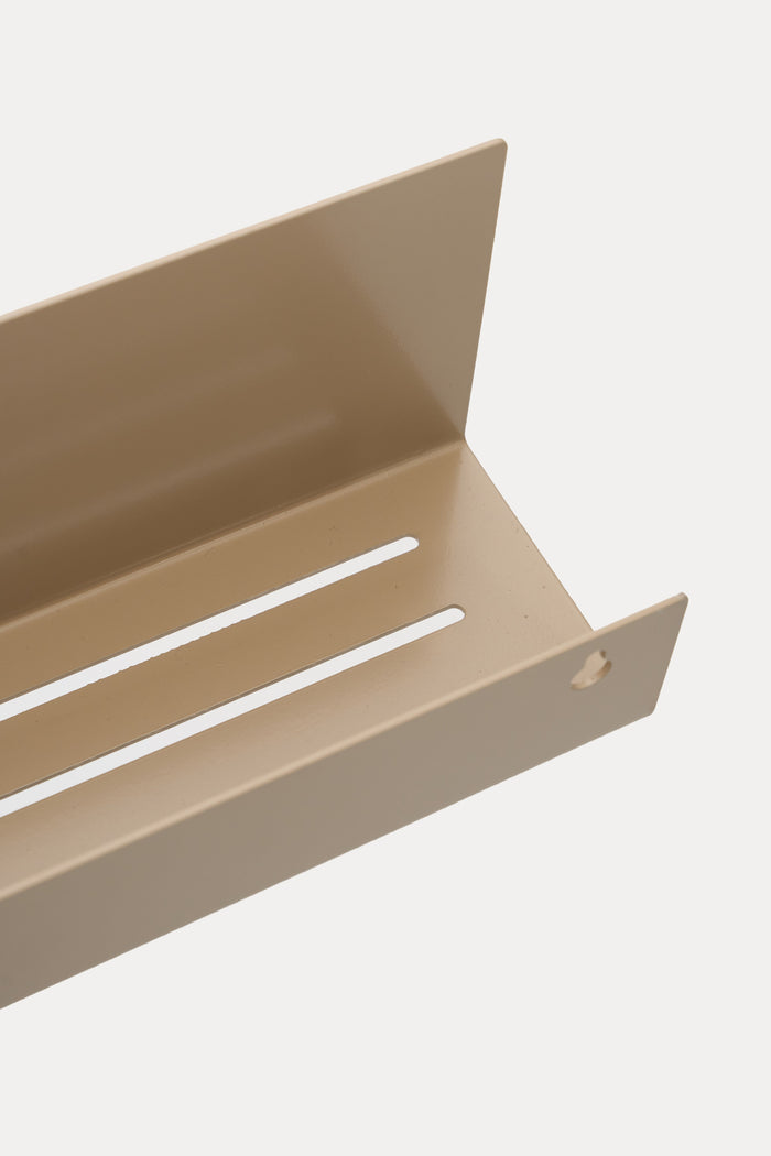
Warm grey beige, calm as raw cloth. Linen is the finish for rooms built on wood, plaster, and natural fibre. It is matte like Chalk and sits comfortably against oak fronts and terracotta floors. On the ELIORA shower shelf it turns a functional tray into something closer to ceramic.
Slate, RAL 7016

Deep anthracite with a cool blue cast. Slate is the first of the three structure finishes: the surface carries a fine grain you can feel under a fingertip, which scatters light and hides fingerprints. It is darker than most greys but stops short of black, so a LUMO living room shelf in Slate still shows its edges and folds in normal room light.
Umber, RAL 8022

Black brown, the warmest of the darks. Umber reads black from across the room and chocolate up close, which makes it the quiet alternative for anyone who finds pure black too hard. Against brass taps and warm bulbs it is the most forgiving dark we coat.
Graphite, RAL 9005

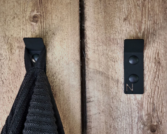
Jet black with a fine mineral grain. Graphite is the workhorse: the classic matte black of steel hardware, structured like Slate and Umber so it wears daily handling without showing it. If you are matching existing black fittings, Graphite is the safe call.
Matte or structure, what is the difference?
Chalk and Linen are matte: smooth, even, soft in the light. Slate, Umber, and Graphite are structure finishes: the cured powder carries a fine texture that you can feel, and it masks dust, fingerprints, and micro scratches better than any smooth dark surface can. Both are the same powder chemistry, baked onto phosphate-treated 3mm cold-rolled steel in one continuous 60 to 80 micrometre skin, and both carry the same two-year guarantee.
Any RAL, if these five are not yours
The five house shades are the ones we mix most, not the limit of the booth. Name any RAL code when you configure a piece and we coat to it, from a deep forest green to a pale silk grey. Screen colours are approximate, so every shade is confirmed against a physical RAL sample before coating. A custom build takes 3 to 5 weeks, with a design visualization inside the first two.
FAQ
What do the ATYP colour names correspond to?
Chalk is RAL 9016, Linen is RAL 1019, Slate is RAL 7016, Umber is RAL 8022, and Graphite is RAL 9005. The names are ours; the codes are the industry standard.
Which ATYP finishes hide fingerprints?
The three structure finishes, Slate, Umber, and Graphite. Their fine surface grain scatters light, so prints and micro scratches show far less than on smooth dark paint.
Can I order a colour outside the five?
Yes. Any RAL shade is available on a made to order piece, confirmed against a physical sample before we coat. Production takes 3 to 5 weeks.
See the finishes on real pieces across the bathroom and living room collections.
Written by ATYP for ATYP, custom metal furniture made in Slovakia.
Design your own